 Website redesign
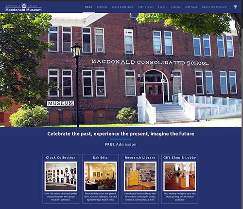
Portfolio: Website – Macdonal Museum
Challenge
- client’s existing site was hard-to-update, not mobile-friendly, based on a discontinued web editing program, and needed more visual appeal
Strategy
- create a site with some wow-factor, to showcase the museum’s strengths and greatly enhance its web presence.
Implementation
- theme: there are few good museum themes available in the theme market, but as I was doing research, I came across this smart home theme that caught my eye with its bold use of nontraditional colours.
- virtual tours: the museum had some legacy virtual tours that were Adobe Flash based. These needed conversion to a framework more compatible with mobile devices. Found a 360 tour developer in New York that had experience doing conversions, and voila – the vtours are now mobile-ready!
- logo: in designing the header, I discovered that the museum didn’t have an official logo. As I looked at the sample one that came with the theme, I saw possibilities, and put together a mockup and asked the museum’s team what they thought. It generated positive feedback, with some tweaks, so I put together a real version using Corel Draw (for scale-ability).
- old and new: one of the challenges in doing any site that has a lot of different items in exhibits, is incorporating photos in ways other than photo galleries. So I took some of the historical photos, darkened and tinted them, and used them as background elements (eg. footer). Look for a sepia-toned historical photo that was merged onto a computer screen, in one of the background elements in the exhibits page.
- photos: the existing site photos hadn’t been updated for quite a while. The executive director Janice took a number of new photos – exterior and interior – which were added to the new site.
- events calendar: because the museum holds regular and special events through the year, it deserved to have a website component that could handle this better than manually putting the info into pages. I found a commercial wordpress event module that offered a lot of flexibility in displaying events, and made it easy to set up recurring ones.
- combining content: the old site had pages with minimal content, that I combined into single pages using tabs (eg, library page). Gives a lot better user experience.
- menu: there was an abundance of site sections, and this always presents challenges in deciding how to group menu items. I decided to use a top bar menu for pages that were likely to be viewed less, such as the volunteer, membership, and privacy pages. The main menu holds the rest.
Result
The new site feels absolutely neat – it formats really well on mobile, and draws desktop users in as well. Parallax backgrounds (moves at different speed than content as user scrolls page) add a 3d effect in some places, without being overdone. Absolutely got my creative muscles stretched on this one.


